Making you hungry before you reach the bottom of the page
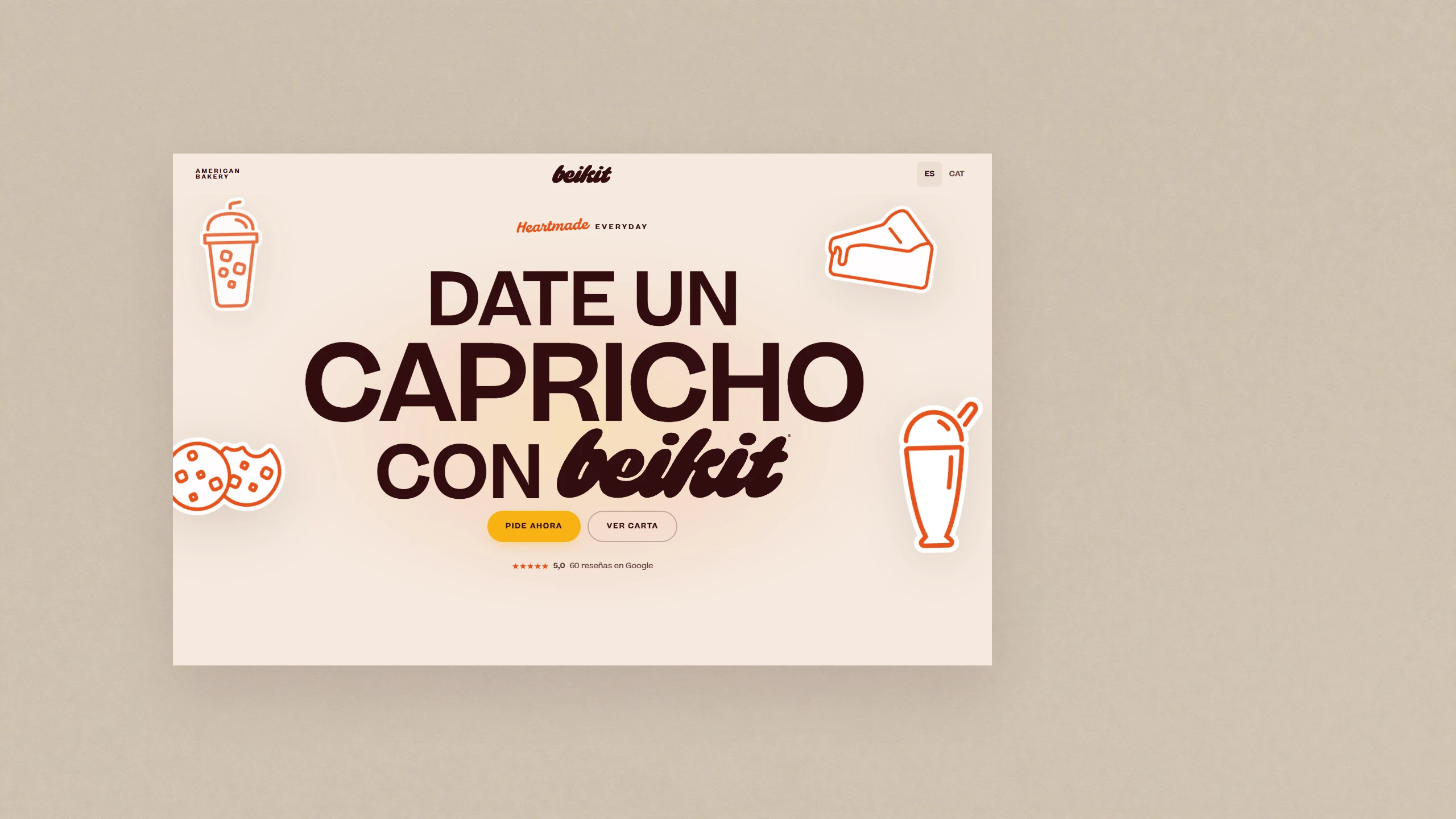
Designing and building Beikit Bakery’s website. Research to deploy, no development team.
Role
- Product Designer
Scope
- End-to-end
Timeline
- 6 weeks
Stack
- Figma, Claude, Claude Code, Lovable, Vercel
The challenge
A bakery opening in six weeks that only existed on social media
Beikit is an American-style bakery in Granollers. No site of its own, no reputation, nothing but the feed. And a deadline tied to a lease and an opening party, so it couldn’t move.
I did all of it: research, architecture, bilingual copy, legal compliance, high-fidelity design for desktop and mobile, and the build itself, from a .md brief to a live site with Claude Code.
~25%
The founders report an increase in online orders in the weeks after launch.
The brand system already existed: logo, palette, typography, illustrations. My work starts where that ends, at how a brand becomes a product.
The research
Nobody wanted to browse. They wanted to order.
Two sessions with Juan and Anna, goals first and brand personality second. Then five interviews with regulars of Twin Bros, their burger restaurant in the same city and the closest proxy audience available before Beikit opened.
What surfaced
- 01
Local bakery sites were hard to navigate and didn’t read as trustworthy. The bar was low.
- 02
People didn’t want to get lost in a catalog. They wanted the shortest path to ordering.
- 03
A new brand borrows no reputation. Trust had to come from the food and from proof that other people already buy there.
- 04
Catering leads die from slow replies and long forms. That’s what people cited for giving up on competitors.
- 05
Almost all traffic would be mobile, and nobody had checked whether a long page works on a phone.
The problem, defined from the user
Primary: the local customer
- Who
- Someone discovering Beikit from Instagram, on their phone
- Needs
- to reach the menu and an order in seconds, without scrolling the whole page
- Because
- they don’t know the brand yet, and judge whether it’s worth their time before spending any scroll on it.
Secondary: the catering client
- Who
- Someone organizing a company event in the Vallès Oriental
- Needs
- to see at a glance what they can order and know when they’ll get a reply
- Because
- they abandon any supplier that asks for a long form with no guarantee of a reply.
Underneath both: nobody arrives at a new bakery’s site with patience or with prior trust. Both have to be won in the first few seconds, and not with brand content, but by removing steps and showing that other people already buy there.
Every insight produced a decision
Local competitors are generic and hard to navigate
A single scrolling page, food-first, on a five-layer visual system pulled from the brand’s own Instagram
New brand, zero existing trust
“Bestseller” badges, and the live Google rating directly under the CTAs
They want to order fast, not browse
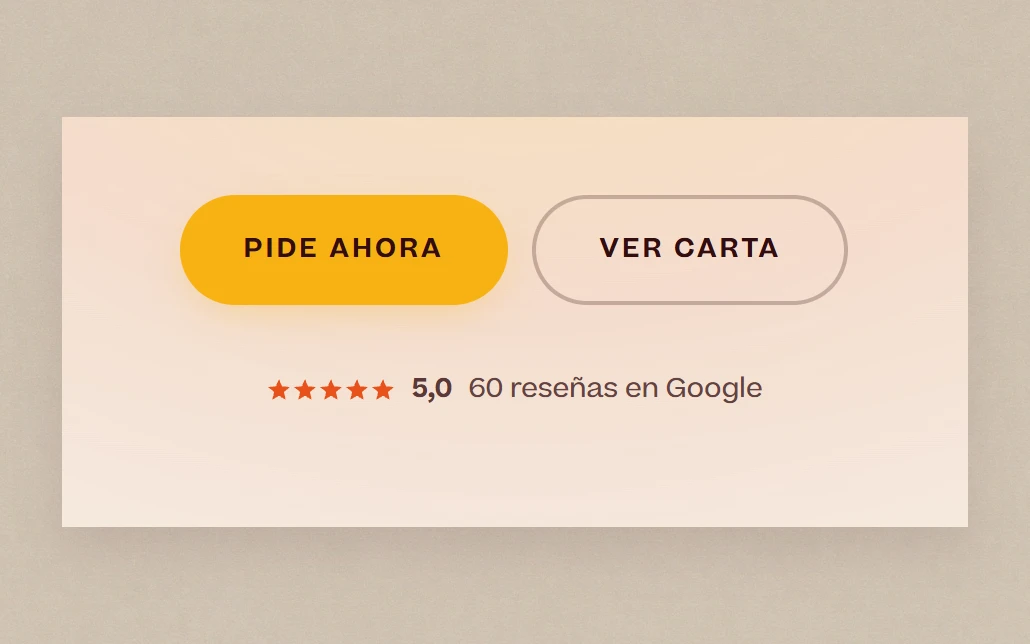
Two-tier hero CTA: “Pide ahora” / “Ver carta”. Three explicit ordering paths
Catering dies in long forms
An 8-field form, real-time validation, and a visible 48-hour response commitment
Mobile traffic plus a long page means people who never reach the CTA
A persistent bottom navigation bar on mobile
Constraints
What couldn’t move
The date
Tied to the physical opening, not to a sprint.
No developer
I was the only person who could take this from Figma to a production URL.
Real legal exposure
RGPD/LOPDGDD non-compliance in Spain carries fines from €3,000 to €300,000.
The business model changed mid-project
The founders wanted their own checkout. They signed a delivery partnership instead, and the requirement disappeared.
Mobile-first usage, desktop-first review
Traffic would be mobile, but the founders reviewed on a large screen. That mismatch drove the most important decision in the project.
Launching a few weeks late would have cost the business almost nothing: a few more weeks without an online presence. What it would have cost was my own standard. Juan and Anna set that date, and a deadline I agree to with a stakeholder isn’t negotiable for me, whether or not missing it shows.
The decisions
Five decisions to make a screen feel edible
Beikit sells something you can’t smell or taste through a screen. The entire interface exists to compensate.
What the interface is built on
The photo doesn’t illustrate, it converts
Images of desirable food produce measurable neural and physiological responses. Which is why every product shot is cut out: with no background competing, there is nothing else to look at.
Spence et al., Brain and Cognition, 2016
Colour sets the flavour expectation
Colour and basic taste associate consistently: red and pink with sweet, brown with roasted. Beikit’s palette lives entirely in that register.
Curves taste sweet
Rounded forms read as sweet, angular ones as bitter. The system is obsessively curved: squircle radius, waves, a sun-shaped isotype, script type. The one angular element is the starburst, reserved for novelty and never used on product.
Aesthetics substitute for reputation
An attractive interface reads as more trustworthy, and that perception transfers to the product. The von Restorff effect is why the “Bestseller” badge works: it is scarce.
On that foundation
Hero CTA hierarchy
“Pide ahora” primary, “Ver carta” secondary, while catering doesn’t exist as a destination yet. The Google rating sits directly beneath: social proof at the decision point, not buried in a footer.
Cards that sell appetite, not information
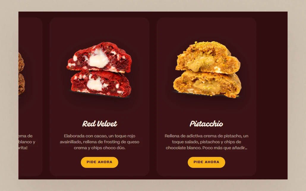
On hover the photo scales up and the whole card takes the product’s colour: a cookie goes brown, a matcha cheesecake goes green. Not decoration. It sets a flavour expectation before the user reads a word.
Three cards per category, not nine
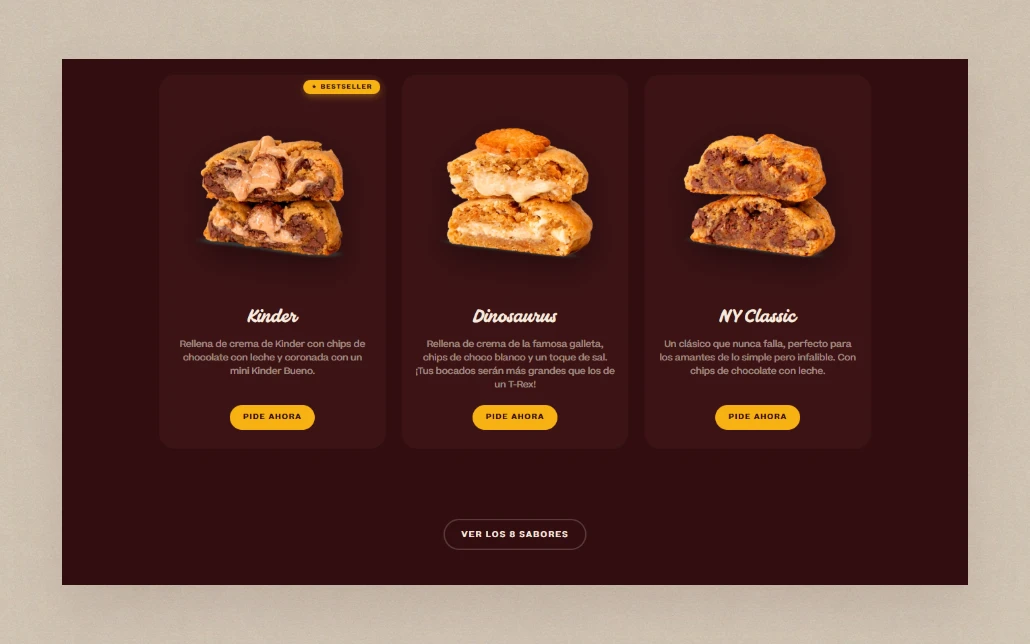
Building the catalog made it obvious it was too long. Hick’s Law and the choice-overload literature agree: nobody decides better with nine flavours competing before they have picked a category. The default caps at three and expands on demand.
Hick 1952; Iyengar & Lepper, Journal of Personality and Social Psychology, 2000
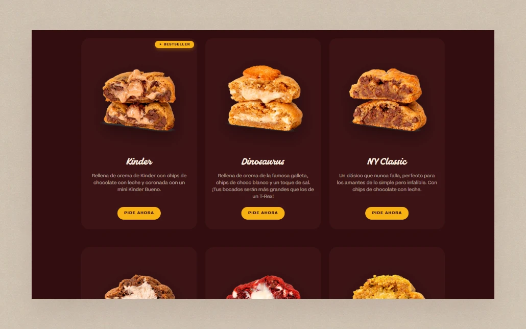
“Bestseller” badges
For a three-week-old bakery with no recognition, a “Bestseller” tag does the job an established brand gets free from word of mouth. It borrows the crowd’s validation before the crowd is visible on the site.
The check I ran with Juan and Anna before shipping: the badge goes only on demonstrably most-ordered items, never on what they want to push that week. That is the line between using social proof and faking it. Category order is their call; the badge and the cap are mine.
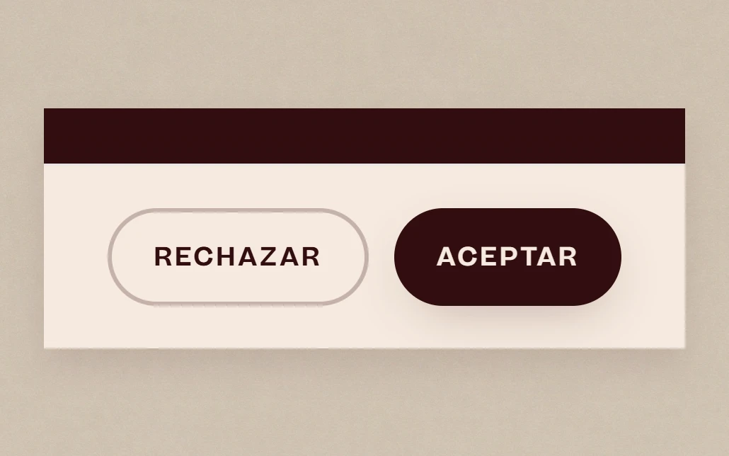
Symmetric cookie buttons: the pattern I chose not to use
European regulators have spent two years fining banners that gave “Accept” more visual weight than “Reject”. Beikit’s gives both buttons the same size: same padding, same type, and the only difference is a fill.
GDPR Article 7 requires it, and it is consistent: every other persuasive pattern here pushes someone toward what they came to do. A dark pattern in a consent banner would push them away from a decision about their own data.
- 01
Hero CTA hierarchy
“Pide ahora” primary, “Ver carta” secondary, while catering doesn’t exist as a destination yet. The Google rating sits directly beneath: social proof at the decision point, not buried in a footer.
- 02
Cards that sell appetite, not information
On hover the photo scales up and the whole card takes the product’s colour: a cookie goes brown, a matcha cheesecake goes green. Not decoration. It sets a flavour expectation before the user reads a word.
 03
03Three cards per category, not nine
Building the catalog made it obvious it was too long. Hick’s Law and the choice-overload literature agree: nobody decides better with nine flavours competing before they have picked a category. The default caps at three and expands on demand.
Hick 1952; Iyengar & Lepper, Journal of Personality and Social Psychology, 2000
 04
04“Bestseller” badges
For a three-week-old bakery with no recognition, a “Bestseller” tag does the job an established brand gets free from word of mouth. It borrows the crowd’s validation before the crowd is visible on the site.
The check I ran with Juan and Anna before shipping: the badge goes only on demonstrably most-ordered items, never on what they want to push that week. That is the line between using social proof and faking it. Category order is their call; the badge and the cap are mine.
 05
05Symmetric cookie buttons: the pattern I chose not to use
European regulators have spent two years fining banners that gave “Accept” more visual weight than “Reject”. Beikit’s gives both buttons the same size: same padding, same type, and the only difference is a fill.
GDPR Article 7 requires it, and it is consistent: every other persuasive pattern here pushes someone toward what they came to do. A dark pattern in a consent banner would push them away from a decision about their own data.
Also shipped
- Bilingual ES/CA copy, adapted rather than translated
- Seven fail states under a single rule: never a dead end
- Three legal pages
- GA4 with Consent Mode v2 and anonymized IP
The decision I’m proudest of
The layout was approved on desktop. The product is used on a phone.
The live product is a long page: hero, full menu, ordering options, brand story, contact. On mobile that length was costing conversions. People dropped off before reaching the menu or the CTA.
A long page’s key actions live wherever the user happens to scroll past them, which is partly in territory the thumb can’t comfortably reach.
Two findings pointed the same way
Fitts’s Law
Closer, larger targets get acted on faster.
Thumb-zone research
Roughly half of people operate a phone with one thumb, which splits the screen into a natural zone at the bottom third, a stretch zone, and a hard-to-reach zone in the top corners.
Where the thumb actually reaches
- Hard to reach
- Stretch
- Natural reach
Without the bar, the two actions that matter sit wherever the reader happens to have scrolled: usually outside the natural zone, never in the same place twice. With it, they are pinned to the bottom band on every screen. Page length stops being a barrier.
Steven Hoober, How Do Users Really Hold Mobile Devices?, 2013
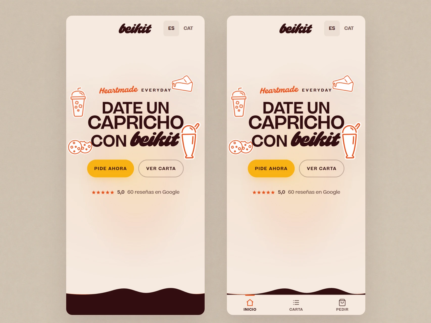
I designed a persistent bottom bar with two shortcuts, “Carta” and “Pedir”. The two actions that matter, permanently inside the natural thumb zone.
It wasn’t in the original PRD. It came from opening the real page on a real phone.
How it was built
From Figma to production without a developer
Early prototypes were validated in Figma, then moved into Lovable to explore structure through vibe coding. We tested hero variants with different product photography and headlines, and different orderings for the sections below.
That is where Carta followed by Pedir came out as the best order past the hero. A competitor’s order CTA sat at the very bottom of the page, which we read as part of why it wasn’t converting. The same hierarchy is what later got anchored in the mobile bottom bar.
After two attempts, Lovable’s chat-based loop didn’t give me the control a brand system this detailed needed. I pivoted the pipeline rather than force the tool.
I designed the full high-fidelity screens in Figma at desktop width. Below 768px I made the responsive calls in the browser instead of drawing a second set of frames: cards from two columns to one, the header collapsing, the Instagram grid from four columns to two, and the mobile-only bottom bar. Never automatic reflow. Each one was a decision I made against the real page on a real phone.
I don’t have screenshots of those early versions. Something I’ll document more carefully next time.
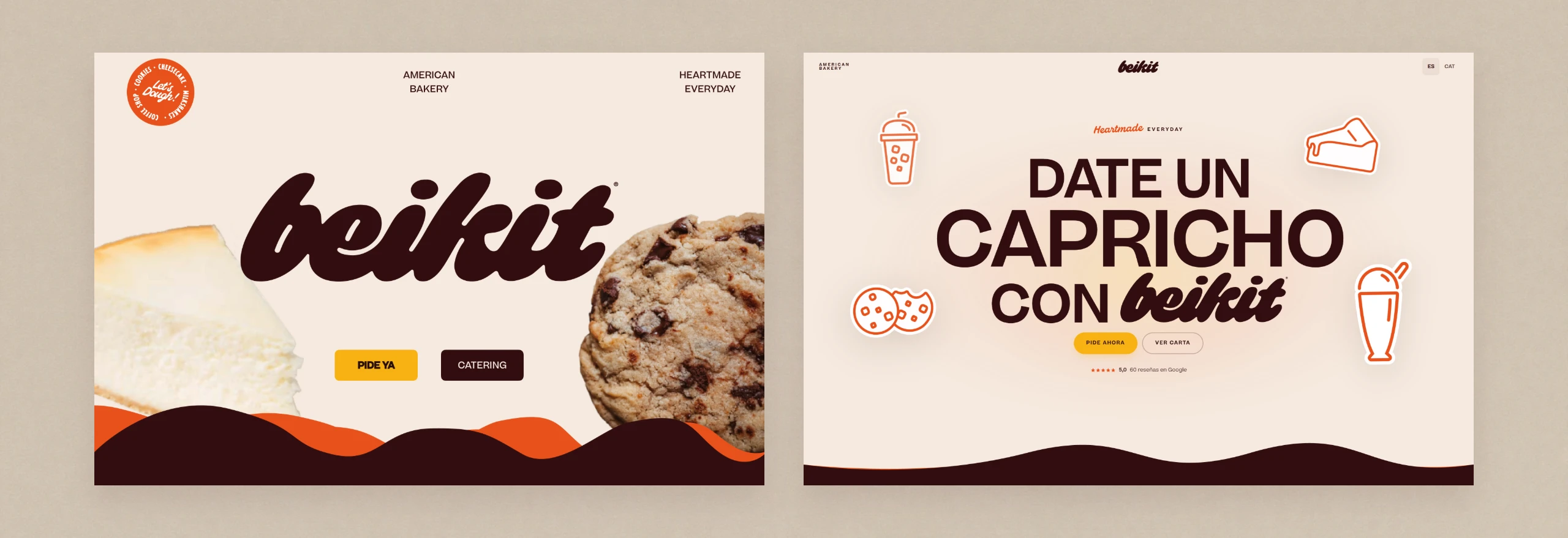
From there, Claude Code with the Figma MCP server pulled design context straight out of those frames. I wrote a brief split into nine sequential phases, so the tool always had one scoped, checkable unit of work instead of “build the site”.
Deployed to Vercel.
- 01Tokens and fonts
- 02Layout
- 03Hero and wave animation
- 04Cards and catalog
- 05Mobile behaviour
- 06The legal layer
- 07Forms
- 08SEO
- 09QA
Reviewed in the browser before moving on
Scope
The page that’s ready, waiting on the green light
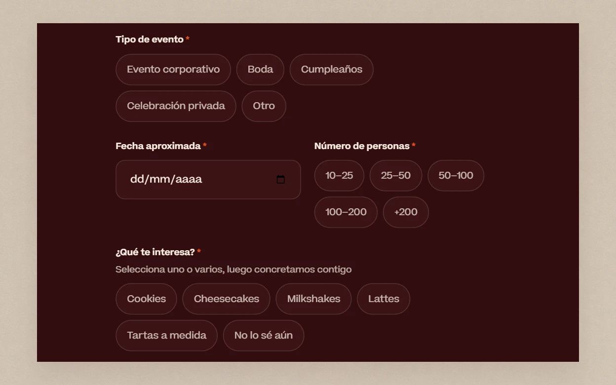
I designed and specified a standalone catering page in full: hero, value proposition, four-step explainer, product listing, and the eight-field form the research called for, with real-time validation, a confirmation page and its own consent clause.
It has been finished since before the opening. It isn’t live because Juan and Anna decided to wait: running catering alongside a brand-new store was too much at once. They’ll switch it on when they decide to.
I’m including it because it marks where my work ends and theirs begins. Design, spec and implementation are mine, and they’re done. When to switch it on is a business call, not mine to make or to rush.
The impact
A 25% lift, and what I can’t prove
The result
A ~25% increase in online orders in the weeks after launch, per the founders.
The evidence I have
Directional, not audited. Beikit is a small business with no formal analytics baseline, and I’d rather say that precisely than inflate it.
The signal I can verify myself
The product is still alive because I’m still iterating on it. Juan and Anna see it daily from the counter, customers respond, and that feedback turns into changes: the phone moved from a landline to a direct mobile line, hours were adjusted to real footfall, the catalog was trimmed from five categories to four. None of that was in the original PRD, and I’m still in the loop.
What I’d do differently
Align scope and requirements more rigorously from day one, not because this project lacked it, but because it’s the discipline I want by default, pivot or no pivot. Define which metrics to track during ideation, not after launch: it’s the only way for the 25% to stop being “per the founders” and become auditable. And keep refining how I direct AI: more workflow planning before building, more precise context in the briefs, and features split across several agents instead of one carrying everything.
Reflection
What AI taught me about design, and none of it is about AI
Directing isn’t the same as asking
The gap between asking for “a cool wave animation” and handing over an exact technical spec wasn’t prompt quality. It was how much I already knew before I wrote it. AI doesn’t shrink the distance between a vague idea and a built thing, only between knowing exactly what you want and having it built. Given something vague, it produces something vague, faster and with more confidence. The skill that mattered is the one I use writing level specs: describing a behaviour until there is no room left for interpretation.
Building fast doesn’t substitute for looking
No AI suggested the bottom bar, because it was never in a prompt. It came from opening the real page on a real phone. Building with AI frees up time. That time can go into building faster, or into the one step no AI does for me: looking at the finished product the way a stranger would. The second is what found the real problem.
Cheap to build doesn’t mean ready to ship
Building the catering page in full cost a fraction of what a developer would have, which made it as easy to switch on as to leave waiting. When building stops being expensive, the brake that used to force the question “is this worth it” disappears. Deciding what ships and when becomes the real job.
All three point at the same thing. AI changed how long it takes me to build. It changed nothing about what I still have to know, look at, or decide before I do.